In one of my case studies, Smarter Add Member Flow for RiserNest, I was dealing with a challenge in member addition form. They had added multi-community feature lately and now it was my turn as the UX designer to find a way in order to align the UI. Creating an effective member addition flow is essential for platforms that manage teams, communities, or any form of digital membership. A well-designed member addition flow helps administrators work efficiently, prevents data errors, and ensures a smooth onboarding process for new members. This post focuses on two key elements that significantly enhance user experience: the position of the form on the screen and the prevention of double work through smarter interface design.
Comparing Modals, Drawers, and New Page Flows
When designing a member addition flow, choosing between a modal, drawer, or dedicated new page has a major impact on user efficiency and satisfaction.
Modals and drawers keep the process in-context. The user can add a member without leaving the current workspace, preserving their focus and mental model. They can quickly return to what they were doing after completing the task. Modals and drawers are especially effective when the task is a secondary action that supports the main workflow, like adding a team member while setting up a project.

On the other hand, new page flows take the user out of their current context. When the member addition form opens in a full new page, users lose sight of the primary task they were handling. This can interrupt their workflow, cause confusion about how to return, and increase the cognitive load. It often leads to extra clicks and navigation steps, making the process feel longer and less fluid.
While a new page might seem like it offers more space and flexibility, the cost to the user experience is often too high for a simple add-member action. New page flows should be reserved for cases where the process is complex enough to justify full attention, such as setting up an entire new organization or advanced member permissions.
Why the Position of the Form Matters in a Member Addition Flow
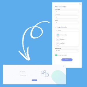
Form placement has a major influence on how easily users can complete tasks, stay focused, and avoid mistakes. Many platforms place forms in narrow side drawers, small pop-ups, or tight modals. These options might appear space-saving but they often create usability challenges.
Narrow side drawers limit how much of the form is visible at once. This can lead to unnecessary scrolling and increase the chance of errors. Users may miss fields or lose track of what they have already entered. Side drawers also pull focus to the edge of the screen, disrupting the natural workflow. This shift in attention can make the task feel awkward and harder to complete.
A smarter approach is to use a full-width bottom drawer or a large, centered modal. These placements offer more space for entering data and reviewing it before submission. They also keep the user’s focus where it naturally belongs, at the center of the screen. This design choice makes the process feel smoother and more controlled.
Wider, better-positioned forms provide room for additional supporting elements. For example, they can display team assignment options, help text, or previews of existing members. When the interface feels open and uncluttered, users can complete tasks with greater confidence and speed.
Preventing Double Work in a Member Addition Flow
One of the most frustrating parts of many member addition flows is being asked to re-enter information that the system could have handled automatically. A common mistake is requiring the admin to enter first name, last name, and email all at once without checking if the email already exists. If the email is already in use, the system then presents an error, and the admin has to go back and start over or fix the input manually.
This not only wastes time but also increases the risk of mistakes and lowers satisfaction.

A smarter member addition flow breaks the process into sensible steps. The first step requests the email address only. The system then checks whether that email is linked to an existing member. If it is, a summary card or confirmation can be shown. This allows the admin to either proceed with linking the member or stop without having wasted effort.
If the email does not exist in the system, the form can move to the next step. At this point, it is appropriate to ask for additional details such as the first name and last name. This structure avoids duplicate entries, prevents unnecessary errors, and saves time for the admin.
This thoughtful design demonstrates respect for users’ time and attention. It reduces friction, supports cleaner data, and creates a better overall experience.
How to Apply These Principles in Your Member Addition Flow
Teams designing or improving member addition flows can put these ideas into practice by following a few clear steps.
Start by evaluating the current position of your form. If the form appears in a cramped side drawer or small modal, consider switching to a full-width bottom drawer or a large centered modal. This change provides more space for data entry and helps users stay focused.
Next, review the sequence of steps in the flow. Ensure that the system checks for existing members as early as possible. This avoids redundant data entry and helps prevent duplicate errors. Build flexibility into the flow so that it can adapt based on what the system finds.
Test the new flow with actual users. Gather feedback to confirm that the process feels intuitive and easy to follow. Look for signs that error rates are lower, task completion times are shorter, and users feel more satisfied.
Finally, design the flow to be future-proof. Ensure that you can add or change steps later without disrupting the habits users have built. This makes it easier to scale or improve the process over time.
Final Thoughts on Smarter Member Addition Flows
Improving the member addition flow is one of the most effective ways to enhance both the user experience and data integrity of a platform. By focusing on form position and designing to prevent double work, you create a process that is faster, cleaner, and more supportive for administrators.
A smart member addition flow reduces frustration, builds trust in the system, and helps teams work more efficiently. These small design choices can have a lasting positive impact on both the platform and the people who use it. Now RiserNest admins will enjoy the implemented solution in member addition flow.